



Supliful Brandkit.
The Supliful brand in one place: logo, color, type, iconography and voice, ready to download and use.
01
Logo
The Supliful logo is the primary expression of the brand. Use the version with the most contrast against its background, and always give it room to breathe.

Logo symbol
The standalone mark, without the wordmark. Use for avatars, app icons and tight spaces where the full logo won’t fit.
Misuse
The logo should always appear as supplied. Don’t do any of the following. Placeholder visuals, to be replaced with finished examples.
Don’t stretch, squash or otherwise distort the proportions.
Don’t recolor the logo or symbol. Use the supplied color variants.
Don’t add drop shadows, glows, gradients or other effects.
Don’t rotate or tilt the logo. Keep it level.
Don’t place the logo on a busy photo without enough contrast.
 supliful
Don’t reconstruct, rearrange or re-typeset the wordmark.
Co-branding & partner lockups
When Supliful appears alongside a partner brand, lock the two up with equal visual weight. X = the height of the lightning bolt, the same unit as the clear-space rule.
Horizontal lockup: Supliful · 1px Neutral-300 divider (gap 1X each side) · partner
- Construction
- Horizontal lockups are the default: Supliful on the left, a vertical divider, the partner mark on the right. Stack vertically (Supliful on top) only when a horizontal lockup won’t fit the space.
- Divider
- A 1px rule in Neutral-300, set to the full height of the taller mark, with a gap of 1X on each side.
- Sizing parity
- Match the two logos by optical height (the Supliful symbol’s height to the partner’s dominant element), not by bounding box. Equal visual weight is the goal. The partner mark is never larger than Supliful’s in a Supliful-issued asset, and never smaller in a partner-issued one.
- Clear space
- The standard 1X clear space applies to the outer edges of the whole lockup. The partner mark keeps its own clear space inside that.
- Minimum size
- The 120px / 24mm minimum applies to the smaller of the two marks, so neither drops below legibility.
- Variant by background
- Main logo on light, inverted/white on dark, the same rule as the standalone mark. Choose the partner’s equivalent variant for the same background.
- Relationship label (optional)
- “In partnership with” / “Powered by Supliful” in Caption style (0.875rem / 500), set in Neutral-600, placed above or below the lockup, never between the two marks.
Lockup don’ts
- Don’t merge or overlap the two marks.
- Don’t recolor the partner logo to Supliful green (or vice versa); each brand keeps its own colors.
- Don’t place a lockup on a busy photo.
- Don’t size the partner mark to dominate.
- Don’t omit the divider and let the marks float ambiguously.
Lockup diagram is a placeholder. Replace the partner slot with the real partner mark.
02
Color
Supliful green leads, anchored by a deep forest dark and a neutral gray scale for text, borders and surfaces. Use the ramps below and click any swatch to copy its HEX.
Brand greenprimary
Neutralsgray · text, borders, surfaces
Values come from the design tokens.
Using the palette
- Surfaces
- White or Neutral-50 pages; Forest for hero, footer and other statement moments.
- Text
- Ink on light surfaces, White on Forest. Green and Amber are accents, not body text colors.
- Green
- The action color: buttons, links, interactive fills. One primary action per view. It stays green even in amber-accented layouts.
- Amber
- The highlight: one accented word in display type, a badge, a data point or a texture detail. A few percent of any layout, on Forest or paired with Ink — never behind white text.
- Composed
- A typical statement layout: Forest background, White display type with a single Amber word, a Green CTA, and at most one textural accent (tone-on-tone symbol or amber halftone). The brandkit hero above is this recipe.
03
Typography
Supliful uses Manrope for everything. Headings are set in ExtraBold (800) with tight, slightly negative letter-spacing; body stays in Regular or Medium for easy reading.
Manrope
AaRegular 400
AaMedium 500
AaSemiBold 600
AaBold 700
AaExtraBold 800
Scale
LevelSizeWeightLine-heightLetter-spacingPreview
Display4.5rem 7xl800 extrabold1 none-0.05em tighterSupliful
Heading 13rem 5xl800 extrabold1.25 tight-0.05em tighterSupliful
Heading 22.25rem 4xl800 extrabold1.25 tight-0.025em tightSupliful
Heading 31.5rem 2xl700 bold1.375 snug-0.025em tightSupliful
Body1rem md400 normal1.5 normal0em normalSupliful
Caption0.875rem sm500 medium1.375 snug0em normalSupliful
Values come from the design tokens; the small label is the token key (e.g. 5xl, extrabold).
Font stack
Apply this stack everywhere Manrope is used, including email and other contexts where the web font may not load. This is the typography.fontFamily.body token; the fallbacks keep metrics close to Manrope.
font-family: Manrope, -apple-system, BlinkMacSystemFont, "Segoe UI", Helvetica, Arial, sans-serif;04
Iconography
We use Phosphor Icons, a flexible, consistent icon family. Default to the Regular weight; use Bold or Fill sparingly for emphasis. Browse the full set at phosphoricons.com.
Weights
05
Components
The core interface recipes from the Supliful product: buttons and cards, resolved from the same tokens as everything else on this page. Grab them as CSS, SCSS or JSON in the Downloads section.
Buttons
Pill-shaped, medium weight, 0.2s transitions, emerald focus ring. One primary per view; outline and ghost for everything alongside it.
PrimaryThe dominant action. Once per view.
SecondaryStrong actions that are not the brand CTA.
OutlineSecondary actions next to a primary.
GhostTertiary and inline actions.
DangerDestructive actions. Confirm first.
Sizes
Card
White surface, 1px neutral-200 border, 16px radius, and a soft shadow that lifts on hover. In the dashboard, cards usually sit borderless on the gray page background; this bordered recipe is for standalone use.
Monthly revenue$12,480+18% vs last month
06
Imagery
Our photography is airy and alive: one subject with real space around it, rich natural color, and a story you get in a single glance, before a word of copy is read.
Title images
If your title image needs a caption to explain who it’s for, it’s the wrong photo.
The subject in context carries the message; the empty space around it carries the layout.

Leave generous empty space around the subject. The photo gets room to breathe, and the space doubles as room for headlines and UI.

Choose colorful, naturally lit shots where the focal point is the subject doing the thing the message is about.
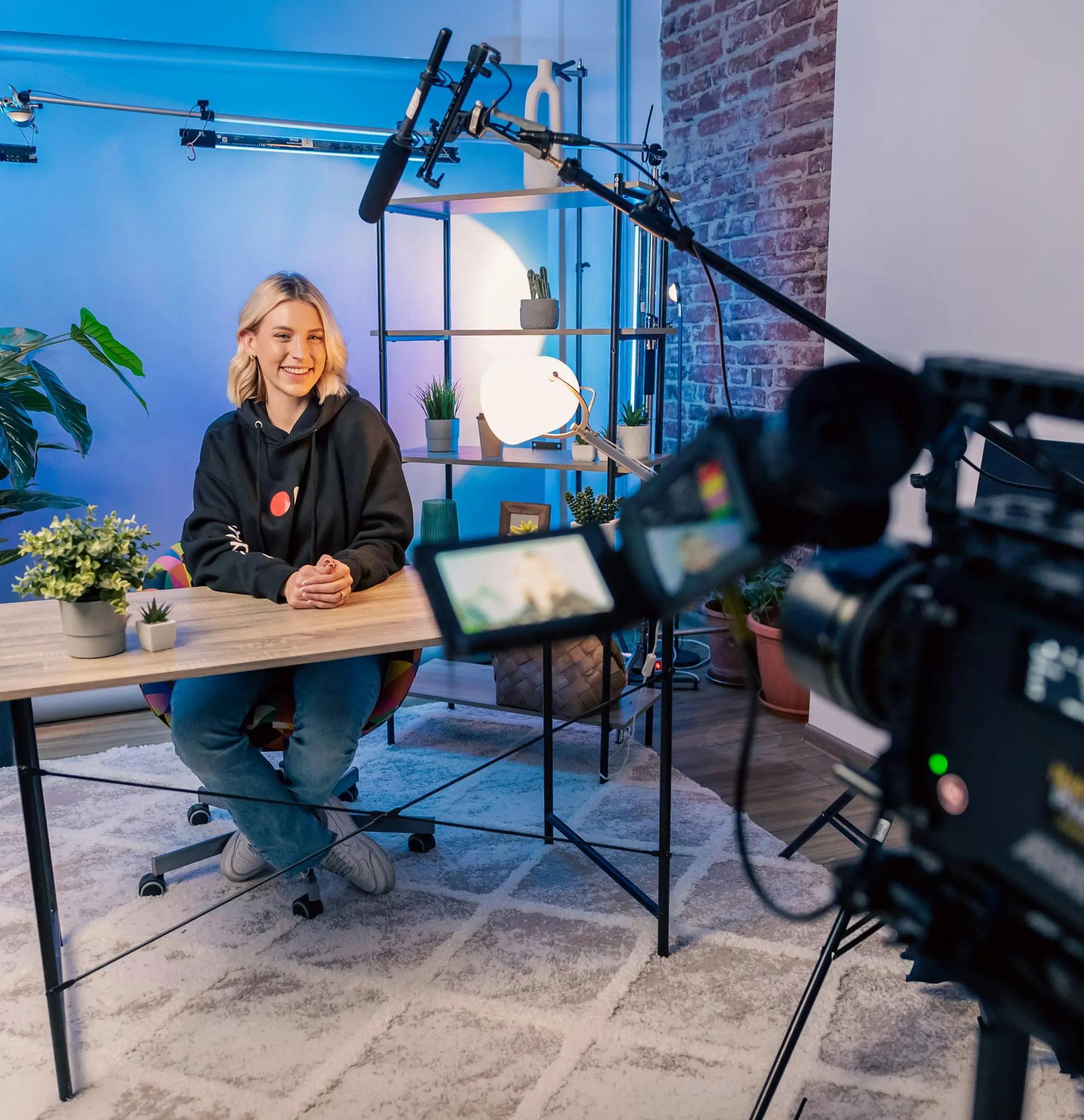
When we speak to a vertical or client base, the image alone should say who it’s for, before a single word is read.

Don’t use generic stock photography: no handshake-in-an-office, no fake “team” shots.

Don’t run flat, washed-out, or heavily filtered photos. If the color doesn’t carry, the image doesn’t run.

Don’t clutter the frame: no busy backgrounds, prop piles, or competing subjects fighting for attention.
'The do column is approved reference photography; the don’t column uses stock stand-ins for illustration only.
Supporting images
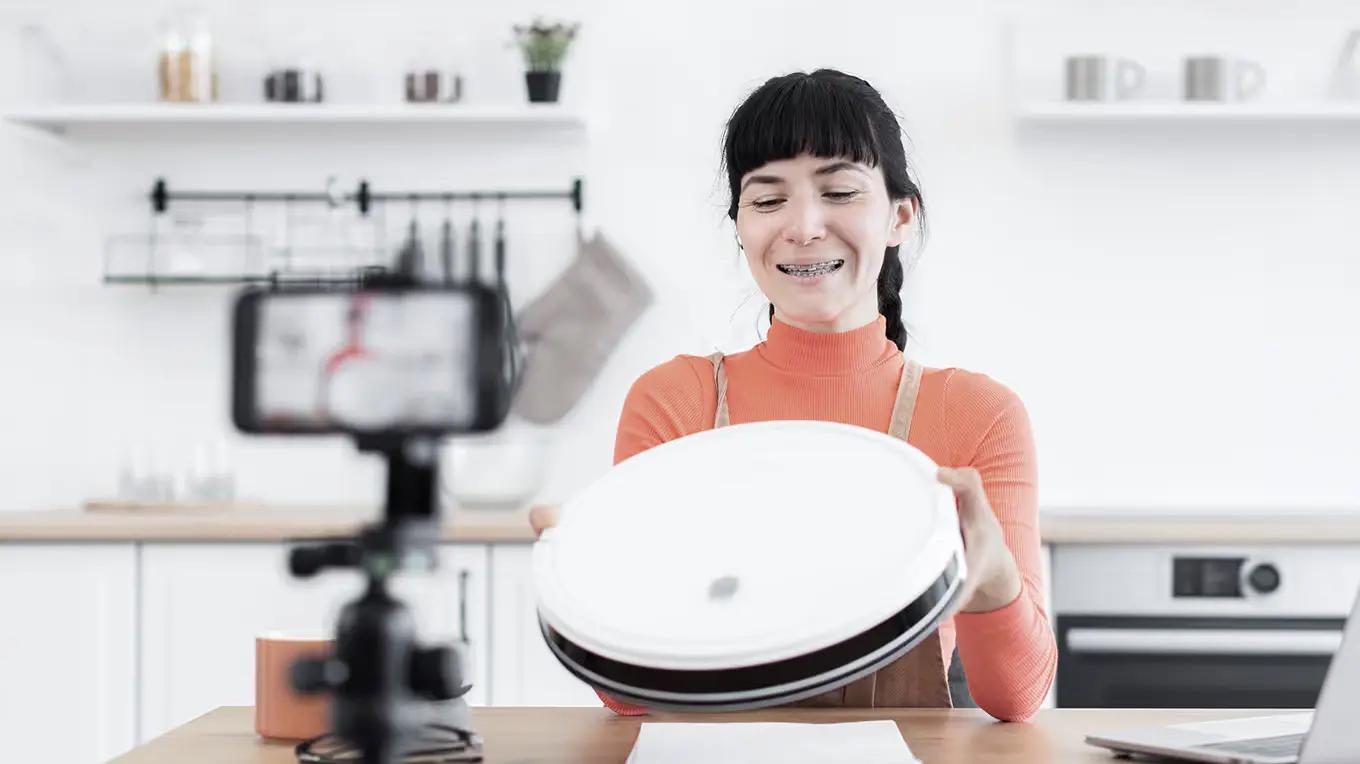
Where title images stay broad, supporting images go into detail: a specific vertical and the products attached to it, shown in real use. The focal point is always the user and the product; the set around them gives context, but never takes the lead.

A skincare creator shows her own products on camera: the vertical is instant, and the user and product hold the frame.
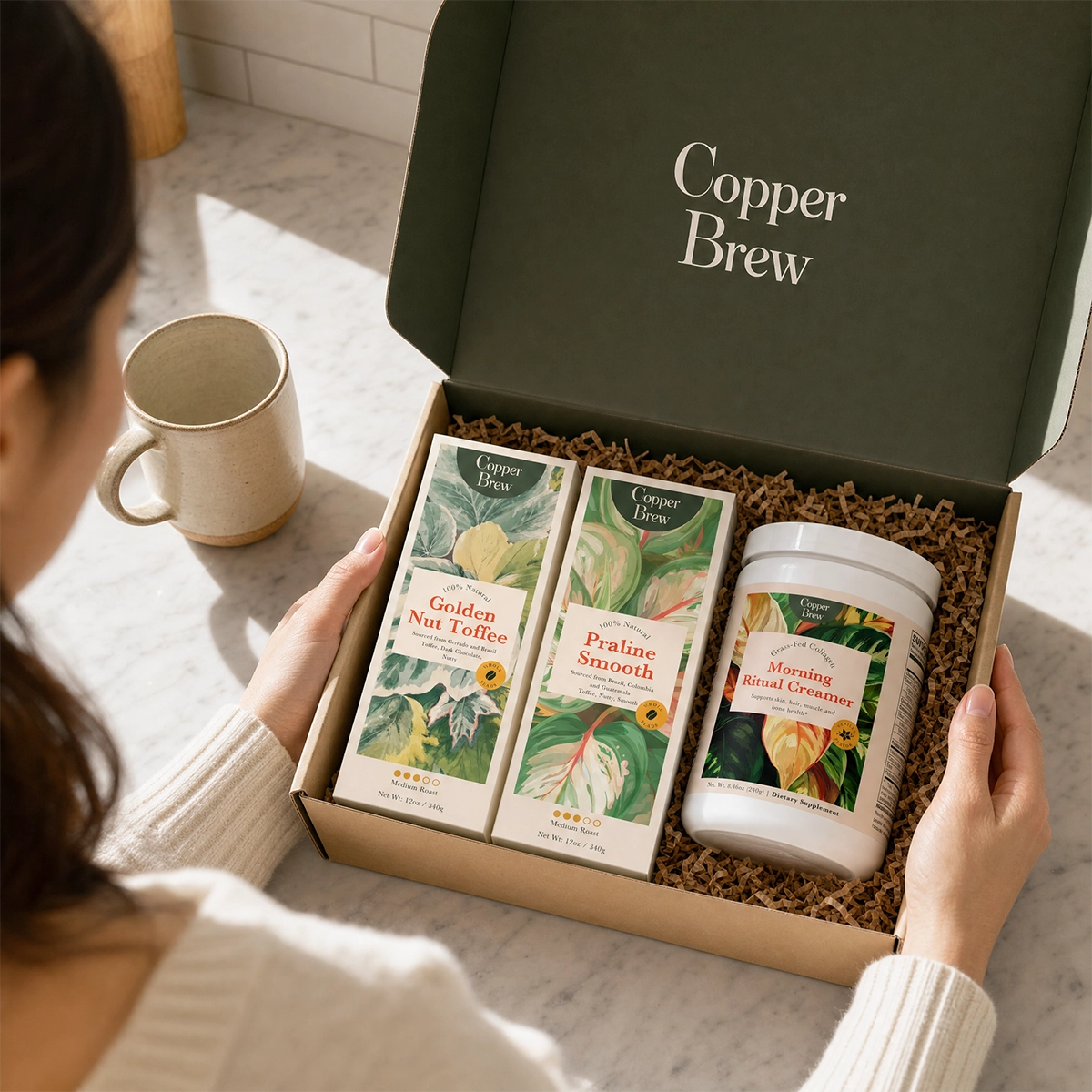
A coffee brand owner unboxes her lineup: a specific vertical and its products, with nothing competing for attention.

A protein supplement in the daily routine: the product in use, and the vertical clear from the first glance.
Don’t use monotone scenes that feel lifeless: everything blends into one washed-out tone and nothing pulls the eye.

Don’t add abstract aesthetic images that don’t tell a story or help to drive it, however polished they look.

Don’t publish imagery that is recognizably AI-generated. Generated images are acceptable only when they hold up as realistic.
07
Tone of voice
We speak to sellers and brand partners as a peer who knows the operational side: a sharp, experienced operator with an edge. Confident, clear, concrete, daring, quietly capable.
Your brand in front. Our infrastructure behind it. Everything we write puts the seller in the hero seat and positions Supliful as the capable, reliable backend. We never compete with the customer’s brand for attention; we make theirs possible.
The five voice pillars
Confident, never loud
State things plainly and let competence speak. No exclamation-point energy, no B2C urgency. The certainty comes from specifics, not volume. Conviction, yes; hype, no.
Concrete over vague
Always reach for the specific: “full catalog access, unlimited custom designs, zero upfront costs,” never “endless possibilities.” If a sentence could belong to any company, rewrite it.
Educational and helpful
Explain why something matters to the reader; don’t just announce it. Teach the operator how to think. Lead with the reader’s problem, not our product.
Honest, never overpromise
No hard guarantees the product can’t back. When there’s a limitation or delay, we frame it honestly rather than paper over it. Credibility is the asset.
Daring, with an edge
We have a spine. Cut the vagueness, say the real thing, and don’t fear a sharp line when it’s earned. The edge comes from candor and conviction: bold because we’re right and can prove it.
On-brand / off-brand
On-brandOff-brand
“Build your brand. Own the market. Claim our full catalog and build your store for free.”vs“Try Supliful FREE today and unlock unlimited possibilities for your dream brand!!”
“Full catalog access, unlimited custom designs, and store sync, on the free plan. Upgrade only when you’re ready to fulfill orders.”vs“Our revolutionary platform makes launching effortless. You’ll be live in 3 days, fully done for you!”
“The old way was too slow, too expensive, and too exclusive. We build infrastructure, so you can build a legacy.”vs“We’re a revolutionary, game-changing platform on an incredible journey to disrupt the entire industry!”
Words & phrases
We reach for
We avoid
08
Boilerplate
Pre-approved descriptions for press, partner sites and bios. Use them verbatim; please don’t paraphrase. Pick the length that fits.
09
Downloads
Grab the complete kit with every logo, symbol and social asset in one zip, or pick individual files below in the format you need.
The complete brandkit
Every public logo, symbol and social asset, bundled as a single ZIP.
Logos



Social




















Other
Component specs (JSON)
Machine-readable Button and Card specs (W3C design-tokens format).
Component styles (CSS)
Button and card recipes from the product UI as CSS classes (sf-btn, sf-card). Light and dark mode.
Component styles (SCSS)
The same button and card recipes as SCSS variables and mixins.